Understanding DEI Insights
Your Friendly Neighbourhood Spider Graph
16 Mar 2026 by Poggy Murray Whitham

Over the weekend, the Divrsity team implemented some super-cool new features. One of my favourites was Radar Charts (also known as Spider Charts or Spider Graphs).
(Note that these new charts work for all existing surveys, as well as new surveys - just click on Results, then "Demographic Rader")
They look visually interesting, but the important question is:
How do they actually help you?
Imagine this situation…
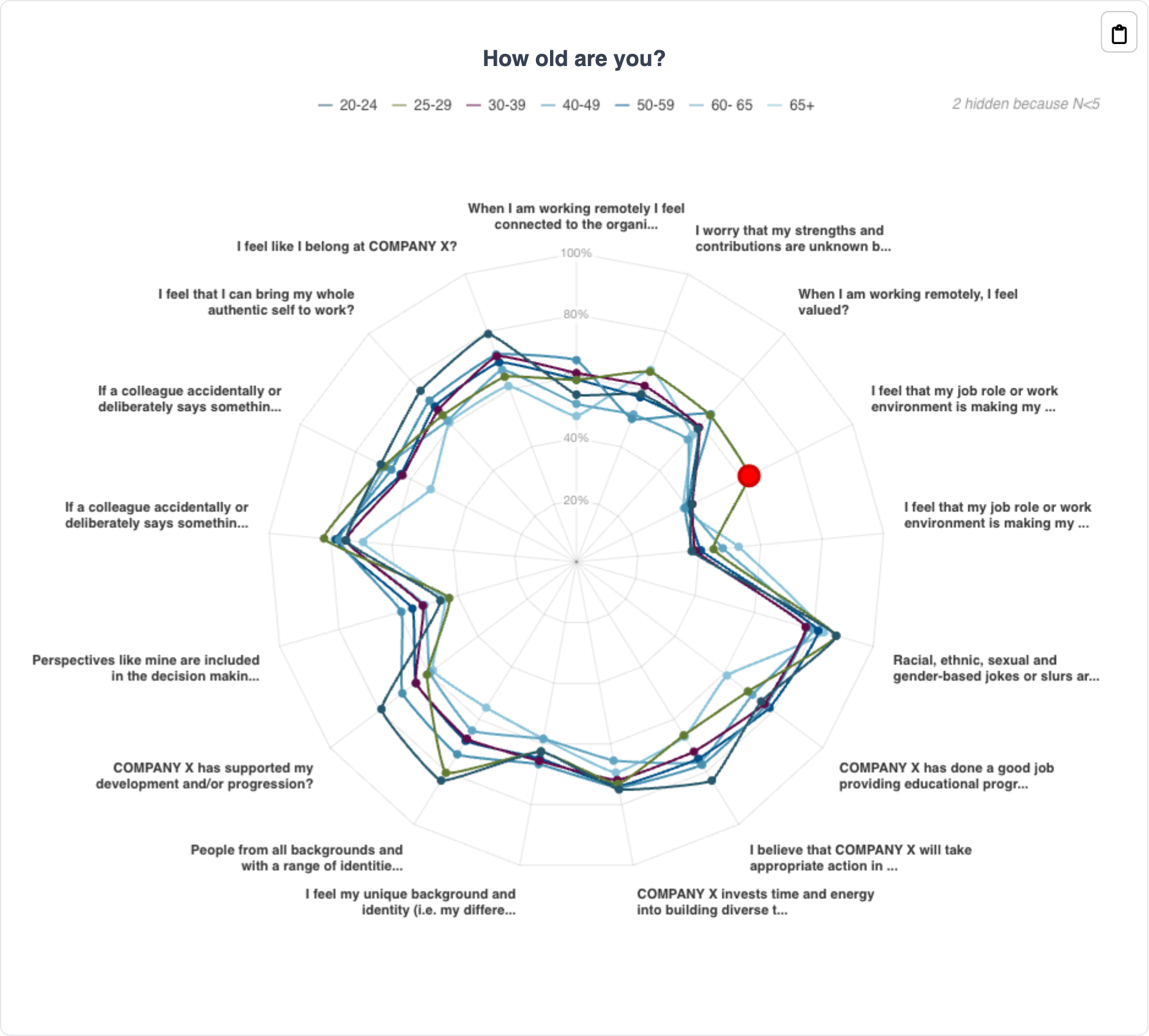
Your workplace has conducted a survey, and the data has come back. For one demographic category, let’s say age, you have multiple different categories:
- 20–24
- 25–29
- 30–39
- 40–49
- 50–59
- 60–65
- 65+
Across these seven demographic categories, you have responses to 17 different questions.
You’ve now been asked to:
- Calculate the average response for each question
- Compare those averages between the age groups
- Identify significant differences that might indicate inequality or cultural issues
- Highlight the key insights for leadership
That sounds like a lot of work, right?
Now imagine doing that not just for age, but for 20+ demographics such as gender identity, ethnicity, disability, sexual orientation, caring responsibilities, and education level.
Suddenly, what looked like a simple survey becomes a full day (or week) of analysis.
This is exactly the kind of problem that data visualisation is designed to solve.
Why Data Visualisation Matters
Data alone rarely tells a story.
Rows of numbers might technically contain insight, but humans are not very good at interpreting complex patterns when everything is presented as raw figures.
Humans understand visuals far faster than raw numbers.
Research from MIT found that the human brain can process images in as little as 13 milliseconds.
When information is presented visually, people can grasp patterns and relationships almost instantly. In business contexts, this matters enormously.
When data is buried in spreadsheets or long reports, decision-makers often struggle to see what’s important. Good data visualisation highlights the story behind the numbers, helping leaders focus on the most important insights.
Good visualisations help organisations:
- Focus on the most important patterns and trends
- Communicate insights clearly across teams
- Improve productivity, because analysts spend less time explaining numbers
- Speed up decisions, because insights are easier to digest
- Build a data-driven culture, where decisions are based on evidence rather than intuition
Put simply: data visualisation drives better decisions based on data. When it comes to diversity, equity and inclusion, this is especially important.
Understanding Multivariate Data
Most workplace surveys are not simple datasets.
They contain multivariate data – datasets that contain multiple variables being measured at the same time.
In a typical DEI survey, these variables might include:
- Demographic characteristics (gender, ethnicity, disability, age, etc.)
- Survey responses (e.g. belonging, fairness, opportunity, leadership trust)
- Organisational factors (department, job level, tenure)
Each employee response sits at the intersection of many different variables.
Researchers studying diversity data often emphasise the importance of recognising that individuals experience the workplace differently depending on how multiple social identities interact.
For example:
- Women may report different experiences than men
- But women of colour may experience different patterns again
- And those experiences may vary further depending on role seniority or department
This complexity is what makes DEI analysis so valuable, but also what makes it difficult.
Without the right tools, identifying patterns across multiple variables quickly becomes overwhelming.
That’s where good visualisation comes in.
Enter the Spider Graph 🕷️
Spider graphs are designed specifically to show multivariate data in a way that’s easy to compare.
Each axis of the chart represents a different variable. In our case, survey questions such as:
- I feel respected at work
- My manager supports my development
- Promotions are fair
- I feel comfortable speaking up
- Leadership values diversity
The chart then plots the average response for each group across these axes.
The result looks a bit like a spider web, hence the name.
But what makes radar charts powerful is that they allow you to compare shapes rather than numbers.
For example:
Imagine plotting 17 survey questions across the radar chart.
Then overlaying different demographic groups on the same chart.
Suddenly you can see:
- Where responses are broadly similar
- Where one group has significantly different experiences
- Which questions show the largest gaps
Rather than scanning through rows of averages, the shape of the graph tells the story.
Patterns jump out visually in seconds.
Why This Matters for DEI Data
Diversity, equity and inclusion data is inherently multivariate.
People’s experiences at work are shaped by many overlapping factors, including identity, role, organisational context and workplace culture.
Traditional reporting methods often simplify this complexity too much.
A single overall average may hide the fact that different groups are having very different experiences.
Spider graphs help surface those differences quickly by allowing analysts to compare multiple survey questions and multiple demographic groups at the same time.
This makes them especially valuable when organisations want to:
- Identify equity gaps
- Understand patterns across multiple questions
- Communicate insights clearly to leadership teams
From Hours of Work to Instant Insight
Remember that example earlier – analysing 17 questions across multiple age groups?
Without Divrsity's built in visualisation capabilities, this might require:
- dozens of spreadsheets
- manual comparisons
- lengthy written summaries
With a spider graph, the same comparison becomes immediately visible.
Instead of scanning rows of numbers, you can simply ask:
- Which shape is larger?
- Where do the shapes diverge?
- Which axis shows the biggest gap?
The analysis becomes intuitive. Instead of spending hours building spreadsheets and calculating averages, you can quickly visualise complex patterns and focus on what really matters:
What the data is telling us, and what we should do about it.
At Divrsity, our goal is to make that process easier, because collecting data is only the first step.
The real value comes from understanding people’s experiences and improving workplaces.
And sometimes, the best way to understand a complex dataset...
...is to look at it through a spider’s web.